Classification of Visual Symbols
Applying the ancient chinese system to modern symbols
Lance Hidy
Long a luxury on the printed page, images and symbols are now as easy to create and share as text. We might venture to say that working with images is actually easier than text. Images transcend language barriers, and are intelligible to children even before they learn to speak. It is no wonder that when digital technology removed the price barriers, images began to flood into our discourse. Young people were in the vanguard, using email emoji, and filling social media with their images.
Academia is struggling to catch up. College courses in visual rhetoric and graphic novels, and conference sessions on multimodal pedagogy are signs of an interdisciplinary awakening. Young professors are showing their older colleagues how to design engaging, image-rich slide shows and course materials.
With one eye on their smart phone, and another on the workplace that awaits them after graduation, students from across disciplines are enrolling in graphic design, video, photography, and web design classes. In my community college classes in photography and design, more than half of the students are from majors outside the art department.
A system of symbols, like any language, needs a grammar to classify its parts. Linguists call such a classification a taxonomy. In writing, the building blocks have names such as letters, syllables, nouns, verbs, conjunctions, pronouns, adverbs, and so forth.
So what are the building blocks of the symbols that we use? Some scholars have brought forth proposals. Graphic designers have been particularly keen to find the right system, and the right terminology, for understanding how to analyze and discuss their work in such genres as trademarks, postage stamps, information graphics, and screen icons.
This quest was articulated by three design theorists at the University of Cincinnati, who recently wrote,
“…now designers are faced with a dizzying array of contradictory terms and categories for describing visual language components: pictograms, icons, symbols, signs, indexes, glyphs, etc. We have no agreed-upon definitions for even the most basic vocabulary, no conceptual model for how these various terms might be organized into logical categories, in effect, no means to categorize and analyze icon or symbol-based visual language systems.” 1
One of the potential systems “to categorize and analyze icon or symbol-based visual language systems” came from the writings of philosopher and logician Charles Sanders Peirce. His idea, semiotics, came into vogue among design academics in the 1990’s. While the vocabulary of semiotics—icons, indices, seme, representamen, qualisign, sinsign, dicent, legisign, and rheme—has not taken root in graphic design, it’s systematic logic has made it a useful tool in artificial intelligence.
Surprisingly, an alternative classification method has been with us for centuries, “hidden in plain sight,” unnoticed by western graphic designers. More intuitive than semiotics, this system was first described in 120 A.D. by the Confucian scholar and philologist Xu Shen in Shuo Wen Jie Zi (Explanations of Simple Characters and Analysis of Compound Characters). This classification system, or taxonomy, was needed to provide a structure for organizing the first Chinese dictionaries. The Xu Shen system has proven its merit, remaining a foundation stone of Chinese linguistics today.
Seeking a more intuitive method than semiotics to use in my teaching, I tried applying the Xu Shen method to western symbols such as logos, just to try it out. To my astonishment, it worked, requiring only minor adjustments. The Chinese categories made sense to my graphic design students. They found them helpful in the development and critique stages when designing logos for hypothetical clients. I, too, have found it useful in my own studio, designing logos for real clients.
On the following pages I present my western adaptation of the 1,900-year-old Chinese system for classifying symbols.
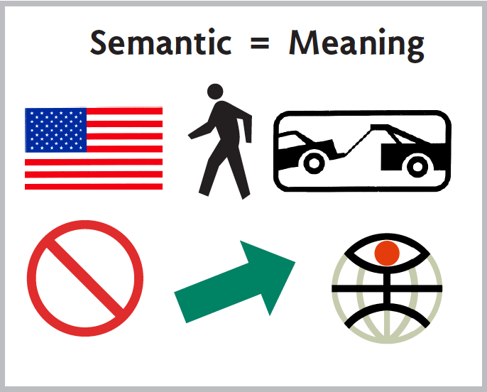
The first principle of the Chinese system is the division of all symbols into two categories: semantic marks that carry meaning, and phonetic ones that represent sound.
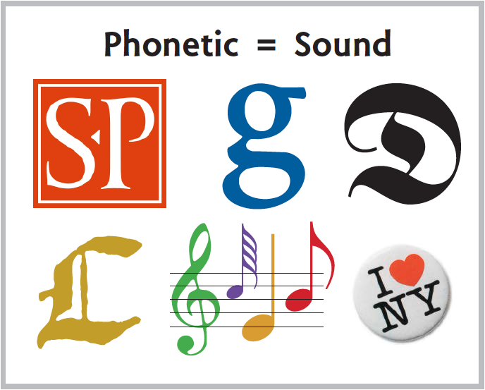
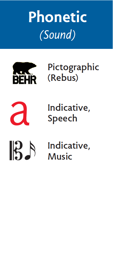
Our abstract phonetic symbols include letters and musical notes, but sometimes we see a pictograph used phonetically, like Milton Glaser’s heart standing for “love.”
The Semantic and Phonetic groups are then subdivided, and combined into eleven groups—the same number used in the Vox typeface classification system. Our symbol system is comprehensive—with a place for every kind of symbol.
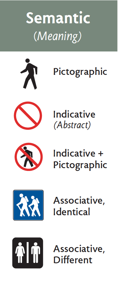
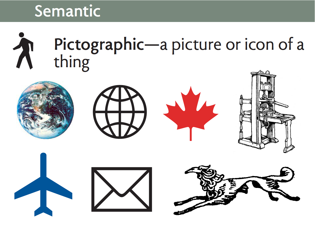
Let’s take a look, starting with the semantic pictograph. These are symbols that describe the shape of an object. They can vary from richly colored photographs to ultra-simplified marks such as those in a symbol font like Wingdings. Bruce Rogers’ hand press and Dwiggins’ Borzoi fall somewhere in-between.
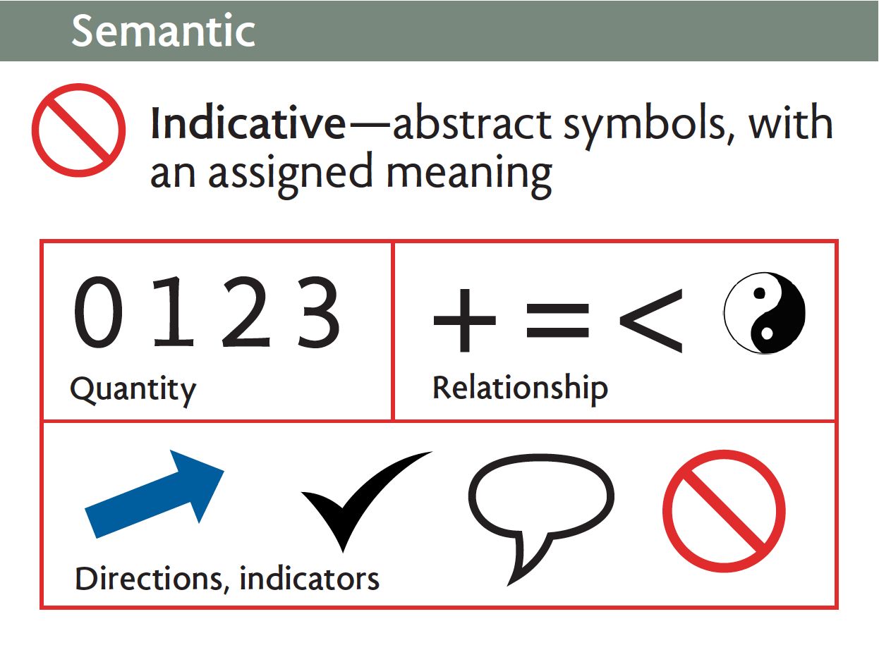
The other kind of semantic symbol is abstract and arbitrary.
Numbers represent quantity.
Relationships are marked by mathematical signs. The Yin Yang symbol stands for balance.
Other marks give directions. The check mark can be used to select an option, or indicate a task accomplished.
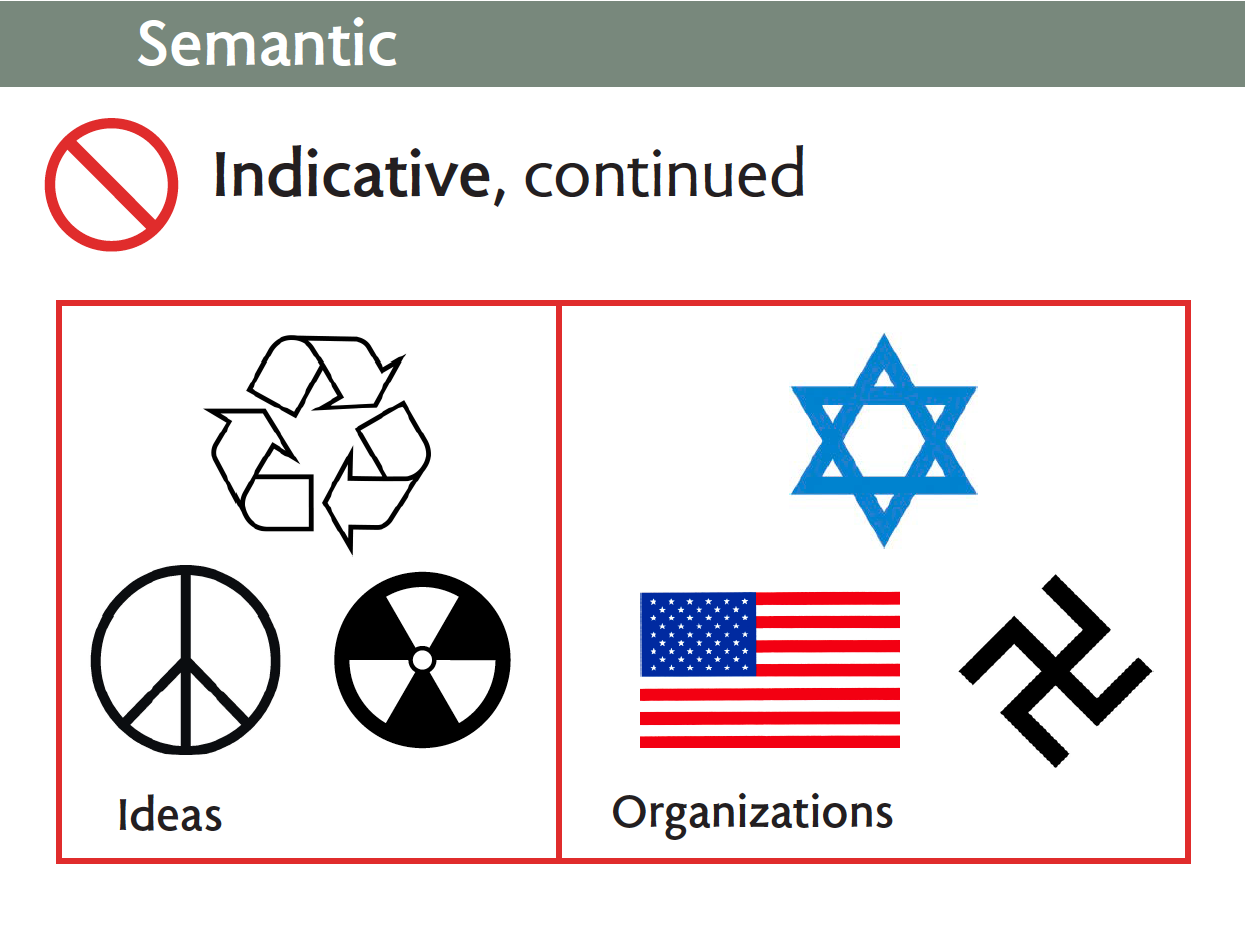
Some abstract symbols are associated with ideas such as recycling, peace, or radioactivity.
Religions, countries, political parties, and other organizations sometimes choose abstract emblems.
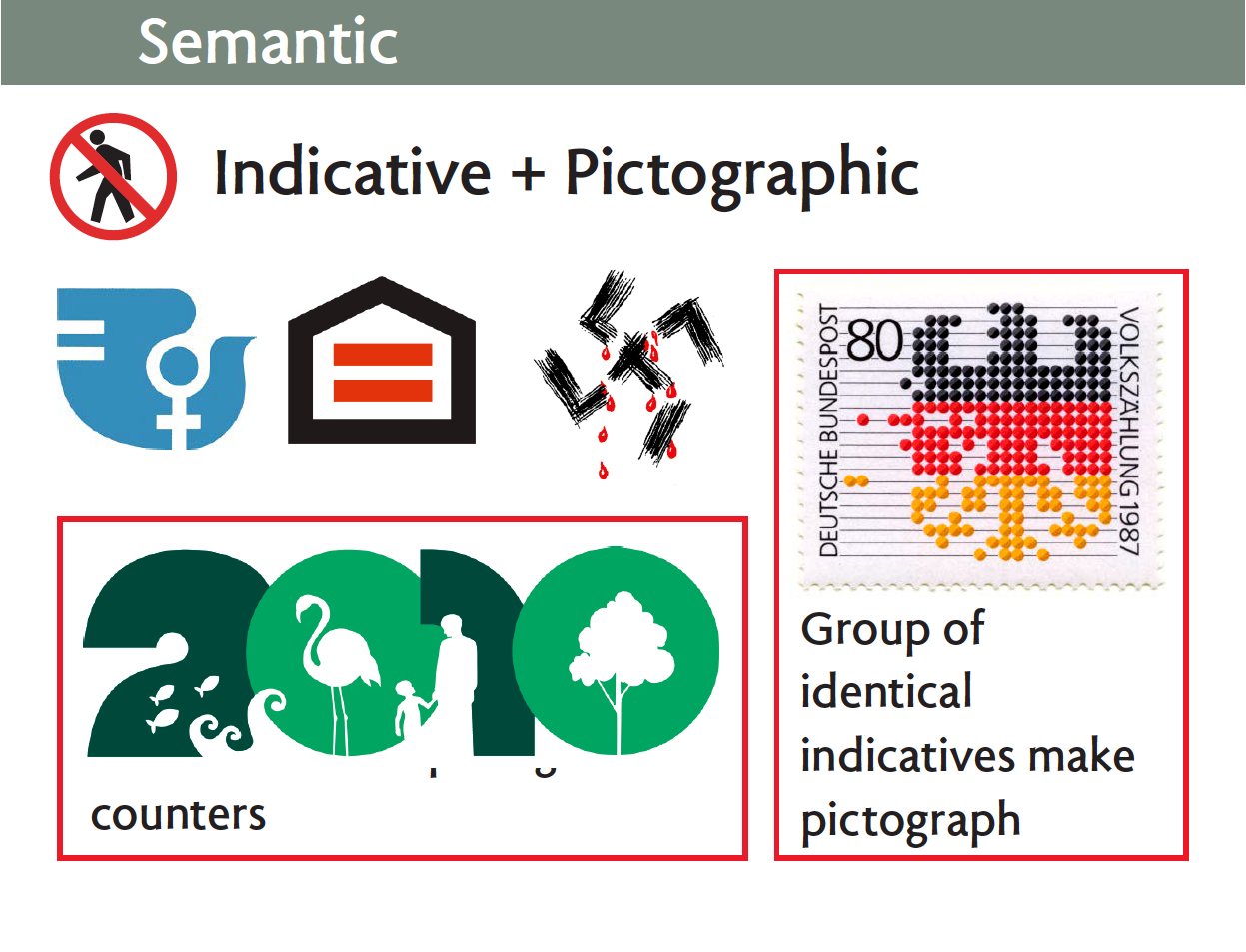
A common method for building symbols is to combine indicative and pictographic marks. The equal sign inside a pictograph of a house symbolizes equal housing opportunity. Pictographs can be used as the counters in numbers. Abstract abacus beads representing people are used to build a German eagle symbolizing the national census.
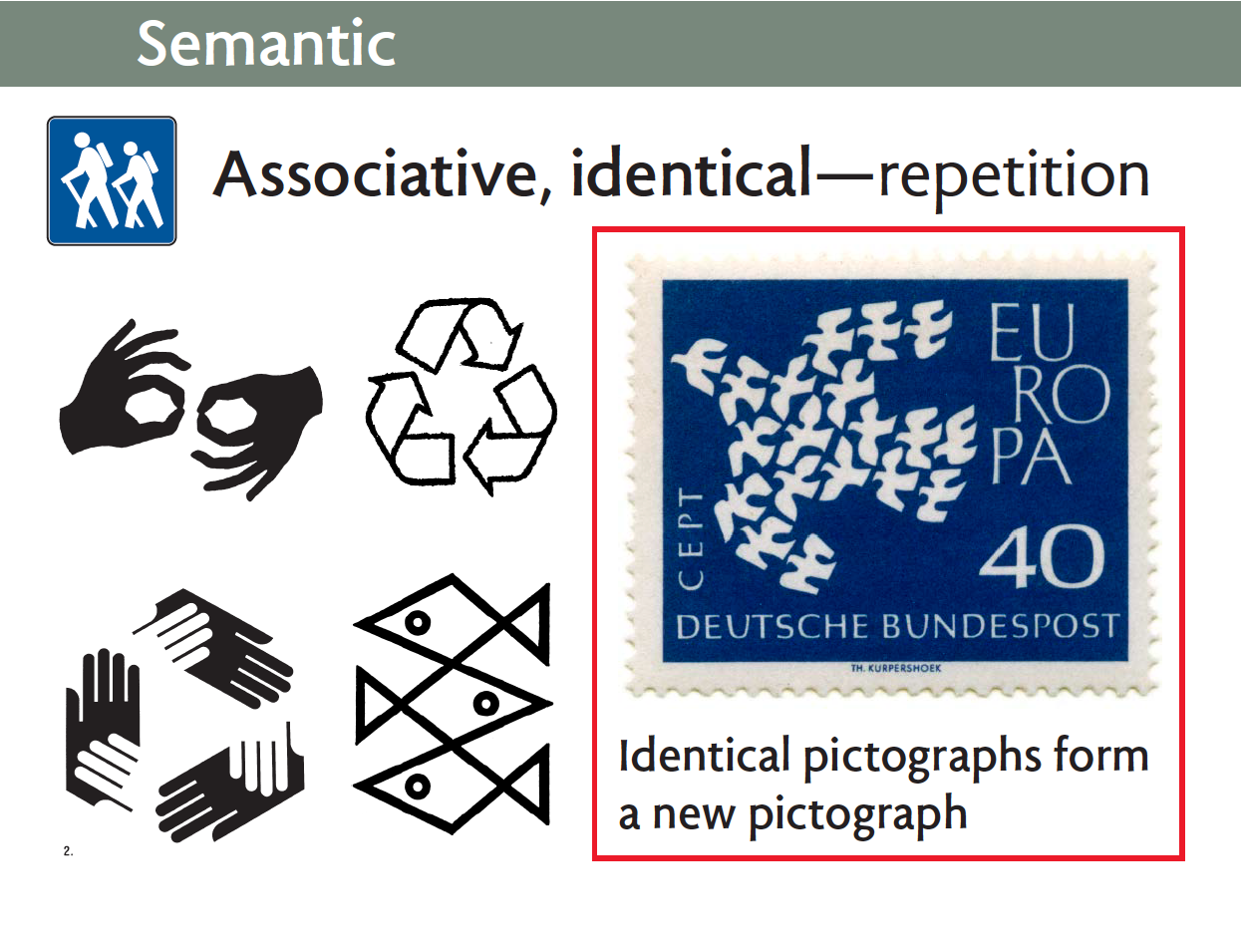
Next you see identical semantic symbols grouped to create a new meaning. Two hands indicate sign language interpretation, while three curved arrows say recycle.
Similar to the eagle on the previous slide, this big dove is composed of nineteen little ones representing the countries of the European Union
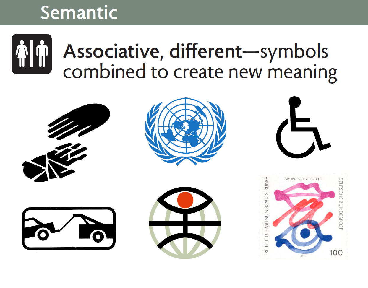
Next are associations of different pictographs. A shattered hand reaches to a whole one in a shelter logo. World peace is envisioned with olive branches encircling a map. My universal design trademark combines a globe, a person and an eye. Freedom of speech, writing, and art are symbolized by a mouth, a letter, and an eye.
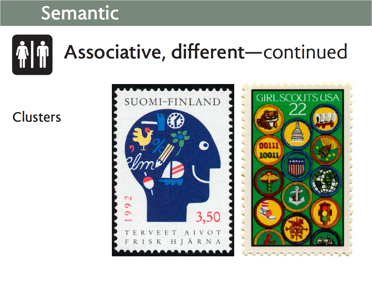
Symbol clusters can represent complex ideas without words, as in this profile of a person’s head filled with symbols of leisure-time activities; or the rich experiences suggested by these fourteen Girl Scout merit badges.
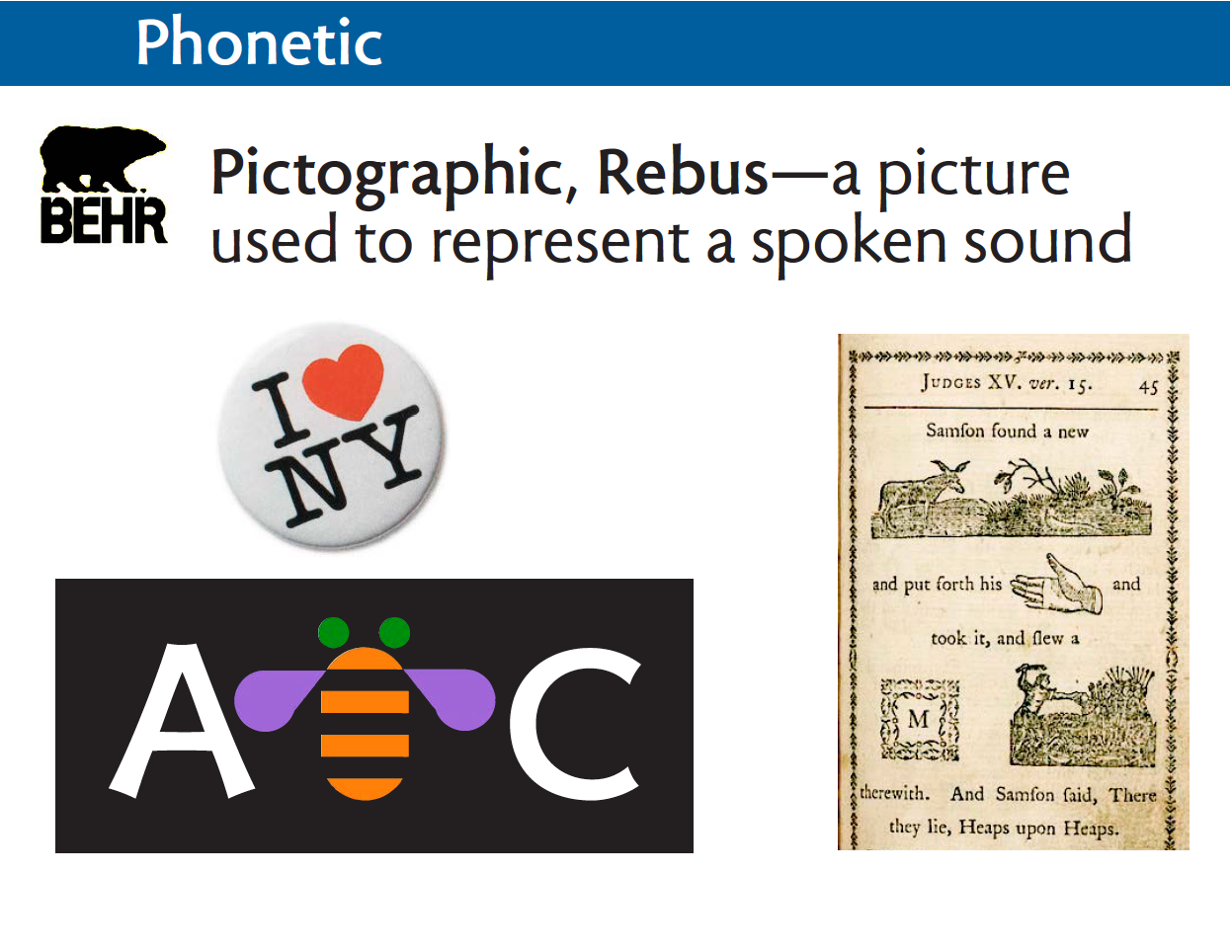
Now we jump over to phonetic symbols. The rebus dates back to the earliest days of writing, when an object’s pictograph would be used to represent a sound. “I love New York” is a familiar modern rebus. Bumblebee is a fun stand-in for the letter B. And Isaiah Thomas’s 18th-century rebus Bible taught reading and scriptures at the same time.
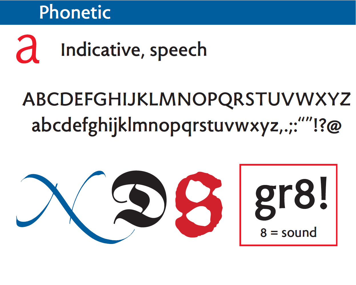
In our writing system, pictographs have been replaced by abstract, indicative symbols that represent sound. We call them letters or punctuation marks.
Indicatives can also be used like a rebus, especially in texting where you can save money by using the single number 8 instead of the last three letters in “great.”
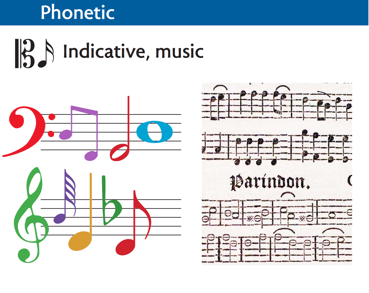
Musical notation is another form of abstract symbolism for sounds. This system evolved from punctuation and other marks used by monks to indicate pauses and tones when transcribing chants. On the right is an example of musical typesetting by Isaiah Thomas, the great printer of the American Revolution.
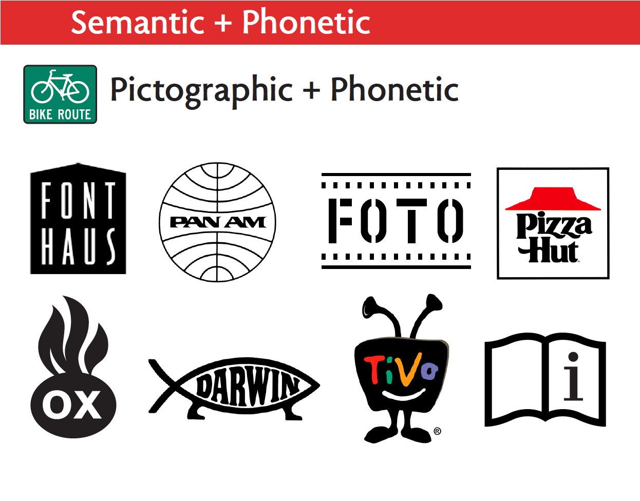
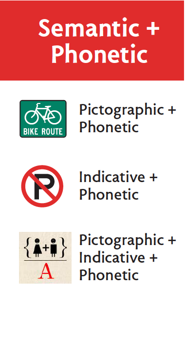
Our final section shows ways of combining semantic and phonetic symbols. We begin here with pictographs and letters.
If you have trouble reading, the pictograph helps you decipher at least part of the message—and it is easy to remember.
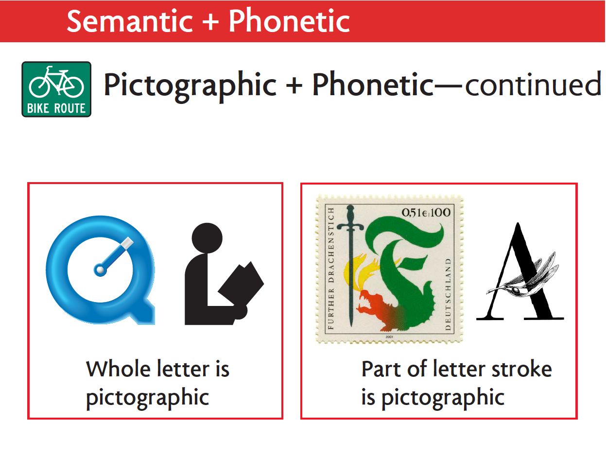
A clever solution is to turn the letter into a pictograph, as in the QuickTime clock and the library L reading a book.
Another approach is to turn one of the strokes of a letter into a pictograph, like this dragon and the olive sprig.
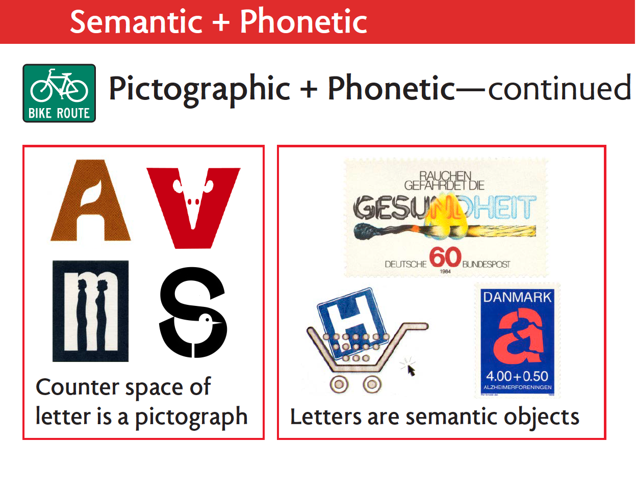
An equally satisfying solution is to put pictographs of a candle, a mouse, people, or a sandpiper into the counter spaces of letters. The red Victor mousetrap logo is an American classic.
Or phonetic letters can be treated like semantic objects that can be burned, put into a shopping cart, or shattered.
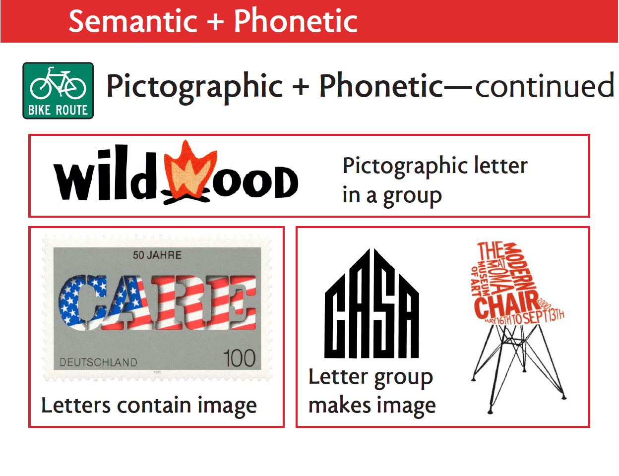
A pictograph for fire can mimic the w in wildwood.
Cookie-cutter letters can contain an American flag.
Or a group of letters can become a house or a chair. Casa is the Center for Alcohol and Substance Abuse at Columbia University.
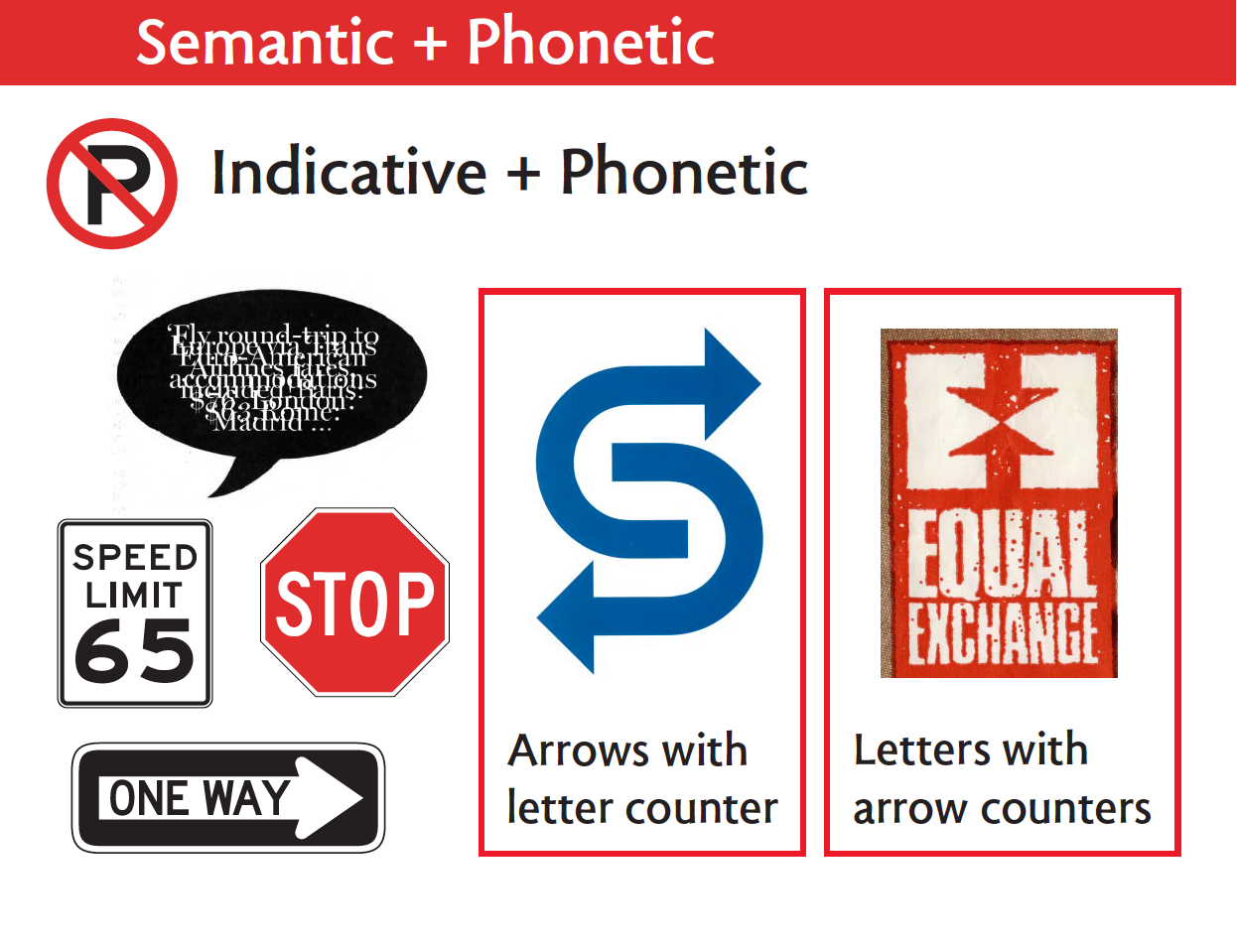
Speech balloons have become a universal device for showing conversation, even when they contain gobbledygook. Road signs use indicatives in the form of numbers, the red circle and slash, the red octagon, or arrows.
Arrows and letters can find ingenious ways to interact with each other’s counter spaces.
Bringing it all together, the Boston Globe does the math with pictographs, indicatives, and phonetics to warn that divorce is expensive.
And finally, a bumper sticker shows how Muslim and Christian pictographs and a Jewish indicative can all coexist peacefully in a phonetic word.
On that hopeful note we conclude our grammar of symbols.
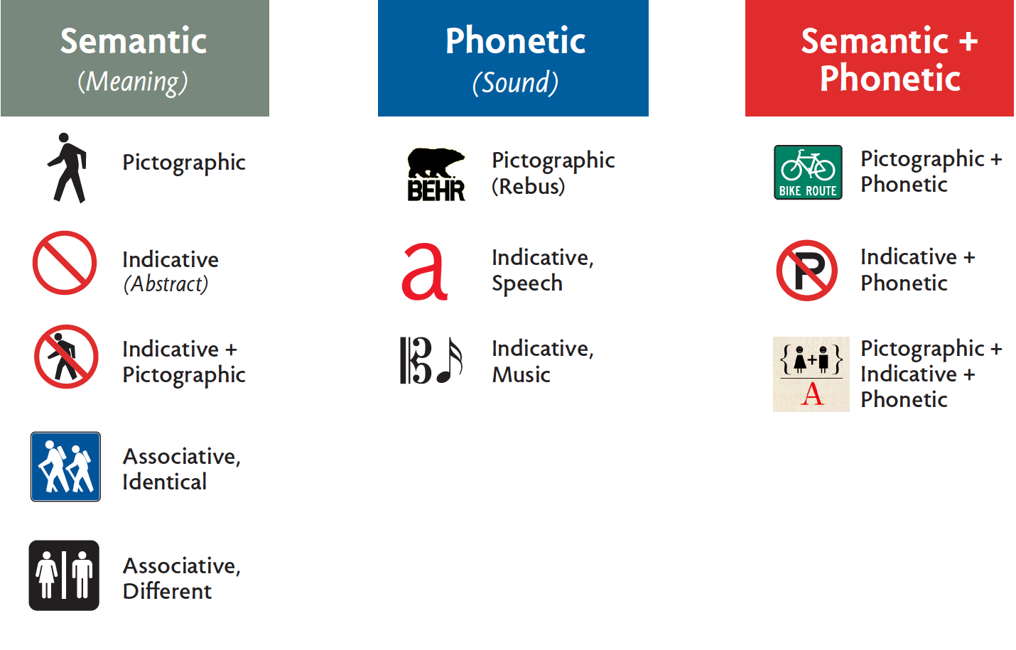
Here, again, is an overview of the classification system:

Footnote
1. Trying on Taxonomies: Research Developing Taxonomies for Analyzing and Developing Icon-Based Visual Language Systems. Marnie Meylor, Mike Zender and Oscar Fernandez. Presented at the Internal Association of Societies of Design Research (IASDR) conference in Seoul, Korea, October 21, 2009]
Bibliography
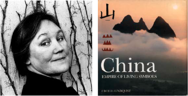
Cecilia Lindqvist. China, Empire of Living Symbols, (Addison-Wesley, 1989) tr. Joan Tate
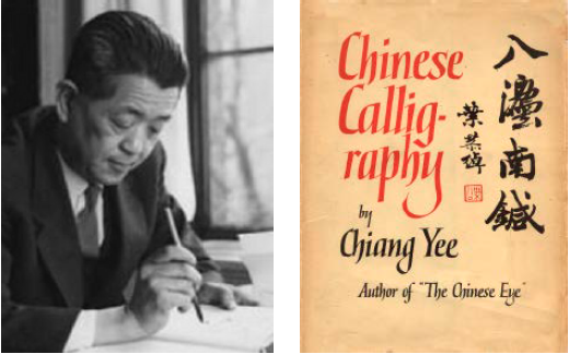
Chiang Yee. Chinese Calligraphy: An Introduction to its Aesthetic and Technique, (Methuen & Co., London, 1938). Hardcover, left; paperback, right.

Yin Binyong , Modern Chinese Characters, (Sinolingua, Beijing, 1994) tr. John S. Rohsenow.
David Crystal. The Cambridge Encyclopedia of Language, Second Edition. (1997). See Logographic writing systems, p. 202.
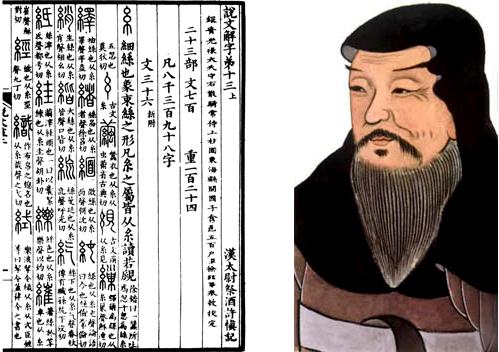
Xu Shen, Shuowen Jie Zi, ca. 100–120 AD.
David Scott. European Stamp Design: A Semiotic Approach to Designing Messages, (Academy Editions, London, 1995)
Per Mollerup. Marks of Excellence: The History and Taxonomy of Trademarks. (Phaidon, London, 1997)
Philip B. Meggs. Type & Image: The Language of Graphic Design. (Van Nostrand Reinhold, New York, 1989)
Rayan Abdullah and Roger Hübner. Pictograms, Icons, and Signs: A Guide to Information Graphics. (Thames & Hudson, London, 2006)
Henry Dreyfuss. Symbol Sourcebook: An Authoritative Guide to International Graphic Symbols. (McGraw-Hill, New York, 1972)
