the work of lance hidy
Home / Publications /
by Philip B. Meggs
Graphic design is a public form of visual communications; it exists to convey a specific message to a predetermined audience. This pragmatic circumstance makes it very difficult for graphic designers to transcend their workaday roles and aspire to the condition of art. The most a graphic designer might hope for is to be able to add a layer of aesthetics upon the visual transmission. By affixing a harmony of color, form, and space to the words and pictures used to convey a message to the audience, the designer can achieve an artistic expression that enhances the communication.
In spite of the vast outpouring of printed matter in contemporary society, graphic designs approaching the condition of art are relatively rare. This is most unfortunate. While fine art only touches a limited number of museum goers and art collectors, graphic design reaches a much wider audience, including people whose social and economic circumstances limit their access to fine art. Even as graphic design performs its useful functions of informing, publicizing, identifying, and persuading, it has the potential of bringing life-enhancing perceptual experiences to its audience.
When a graphic designer manages to achieve an artistic statement with consistency for over two decades, it becomes a cause for celebration and deserves close examination. What circumstances made this aesthetic statement possible? Can lessons applicable to a broader range of visual communications be gleaned from the designer’s work?
Lance Hidy ranks among the graphic designers who jumped the fence and are able to bring a sustained aesthetic dimension to their work. Hidy was steadily building a reputation as an accomplished book typographer, when his life underwent a series of significant changes during the period from 1976 to 1977. After marrying, Hidy moved from Boston to the Northampton area of Massachusetts and shifted his focus from book design to the art of the poster. These decisions speak of commitment, a willingness to take risks, and the courage to face the uncertainties of artistic autonomy. In the tradeoffs between holding a staff position and being a self-employed designer, the latter often affords a level of artistic independence rarely achieved in salaried jobs.
Hidy’s work positions itself on two sides of a great divide. Around 1990, advancements in the graphic capabilities of Macintosh computers and software for typography, imaging, and page layout gave artists and designers powerful new tools. Creating and manipulating images, quickly exploring multiple solutions in the creative process, and unprecedented control and manipulation of type are just some of the revolutionary possibilities unleashed by microprocessor technology. As the design profession heaved and groaned over the transition from drafting board to computer screen, Hidy busily embraced the new technology and explored its creative application to his work. Although many graphic designers’ works before and after the digital divide are virtually indistinguishable, Hidy’s work underwent an early and pronounced transition. An essayist is compelled to deal with pre-Mac Hidy and post-Mac Hidy.
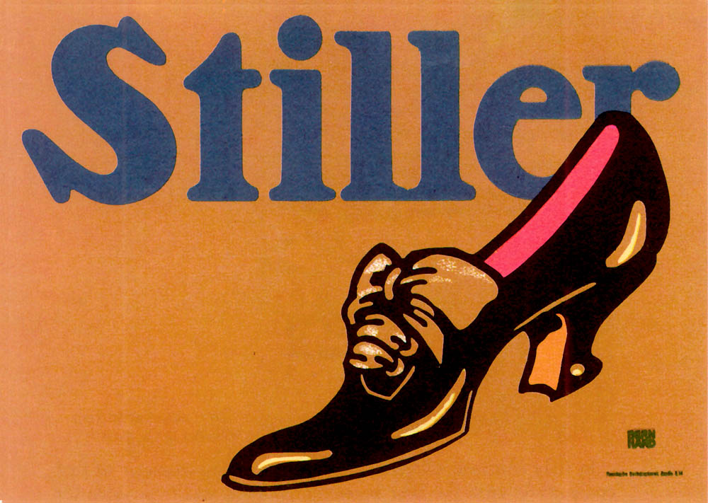
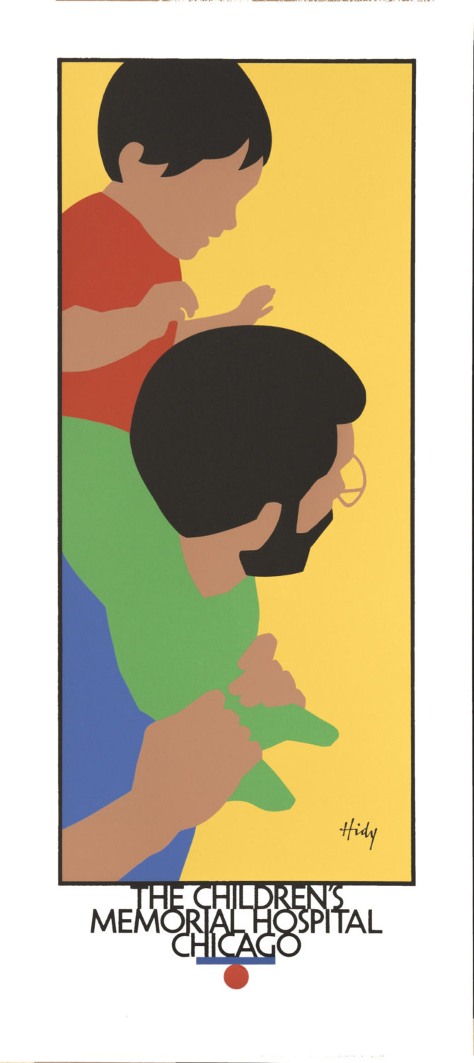
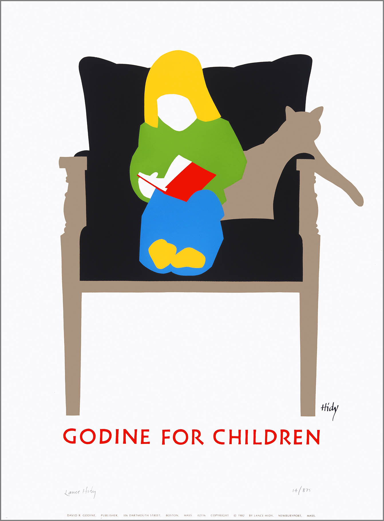
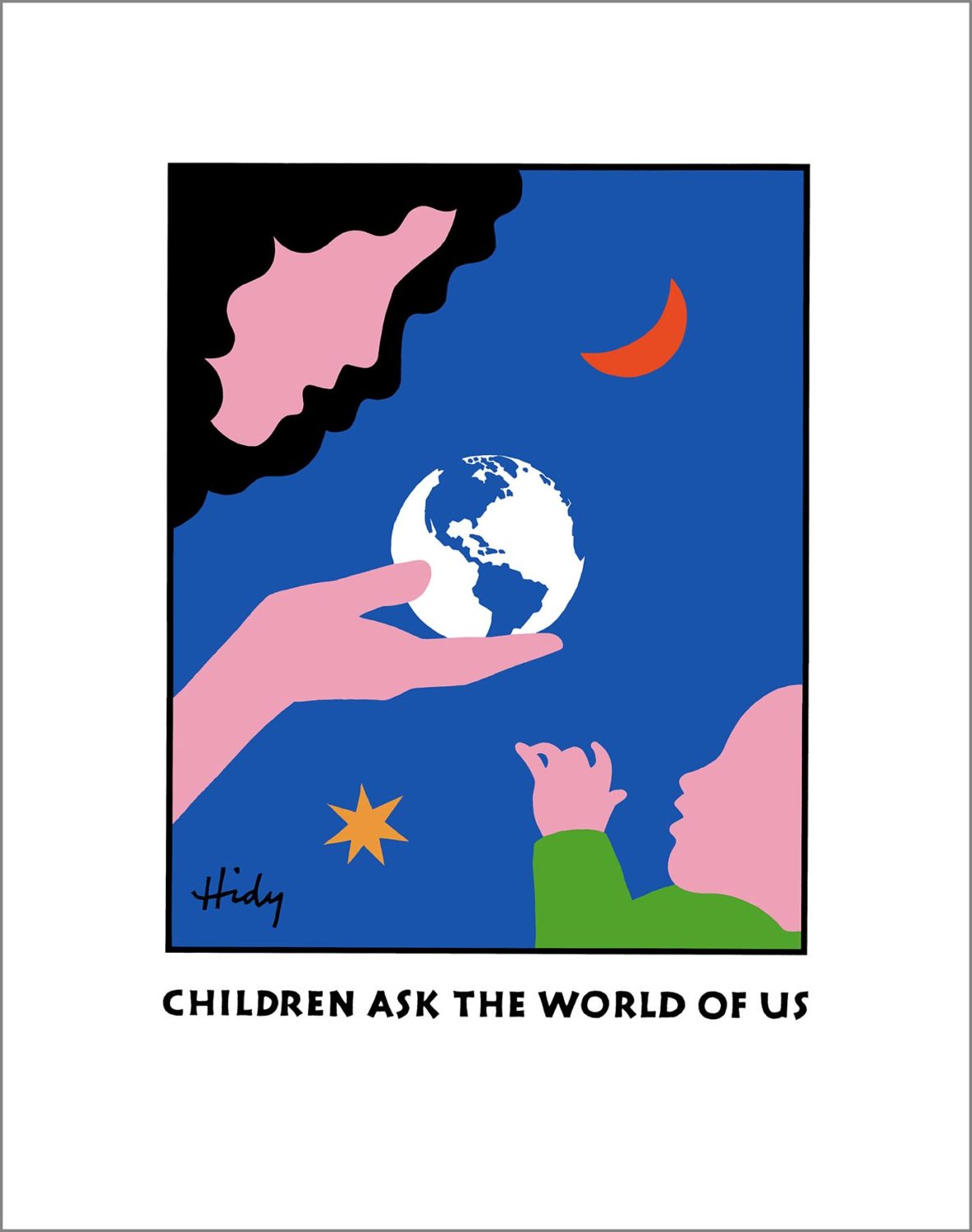
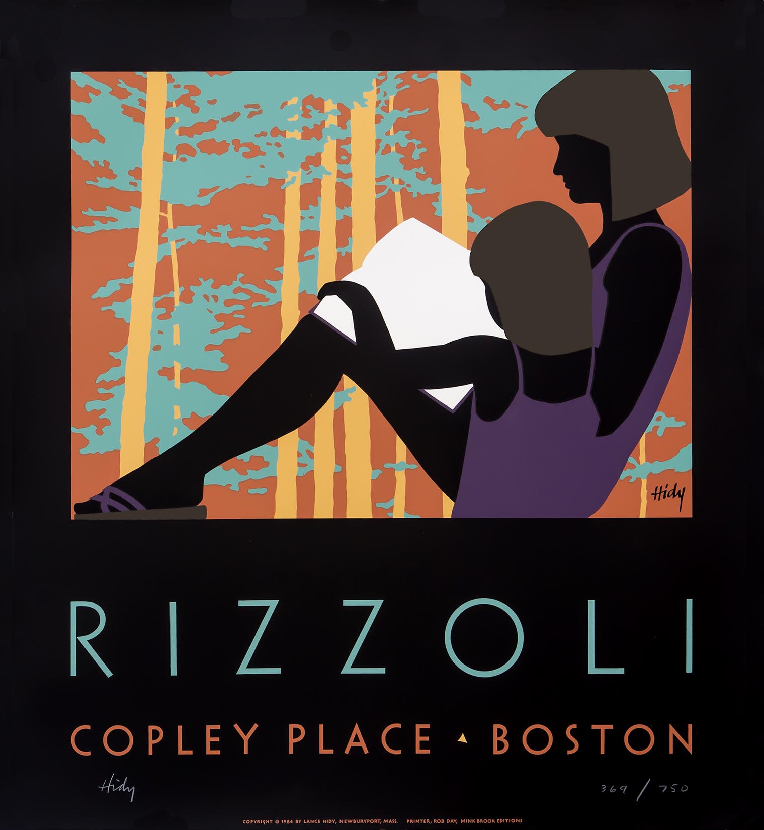
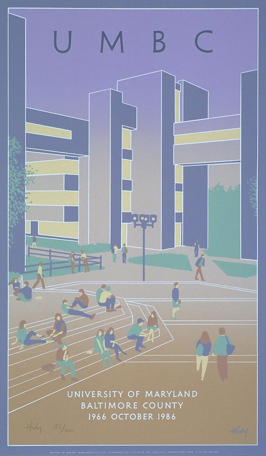
Hidy’s pre-Mac oeuvre is very consistent in approach. Imagery dominates, and typography or lettering plays a support role. Images are primarily derived from Hidy’s photographs. He made vast numbers of reference photographs of each subject, searching for a gesture, pose, or silhouette that captured the essence of that subject. The posters belie their photographic origins and do not reveal their provenance in any way. Hidy distilled iconic and organic shapes from his photographs, editing out details such as features, buttons, and shoelaces. These images evoke the simplification and immediacy of late nineteenth- and early twentieth-century posters by the Beggarstaffs in London, Lucian Bernhard in Berlin, and Ludwig Hohlwein in Munich. But Hidy’s posters of the 1970s and 1980s were not mere paraphrases of these historical models; his subject matter, spatial treatment, and especially his palette are strikingly contemporary.
The production medium was usually silk-screen printing. From 1982 to 1990, master printer Rob Day silk-screened Hidy’s posters. The real medium is color. The rich, pure opaque color of silk-screen printing enhances the chromatic resonance of these works. Although from four to sixteen flat colors were silk screened to produce each poster edition, six colors were used on most of them.
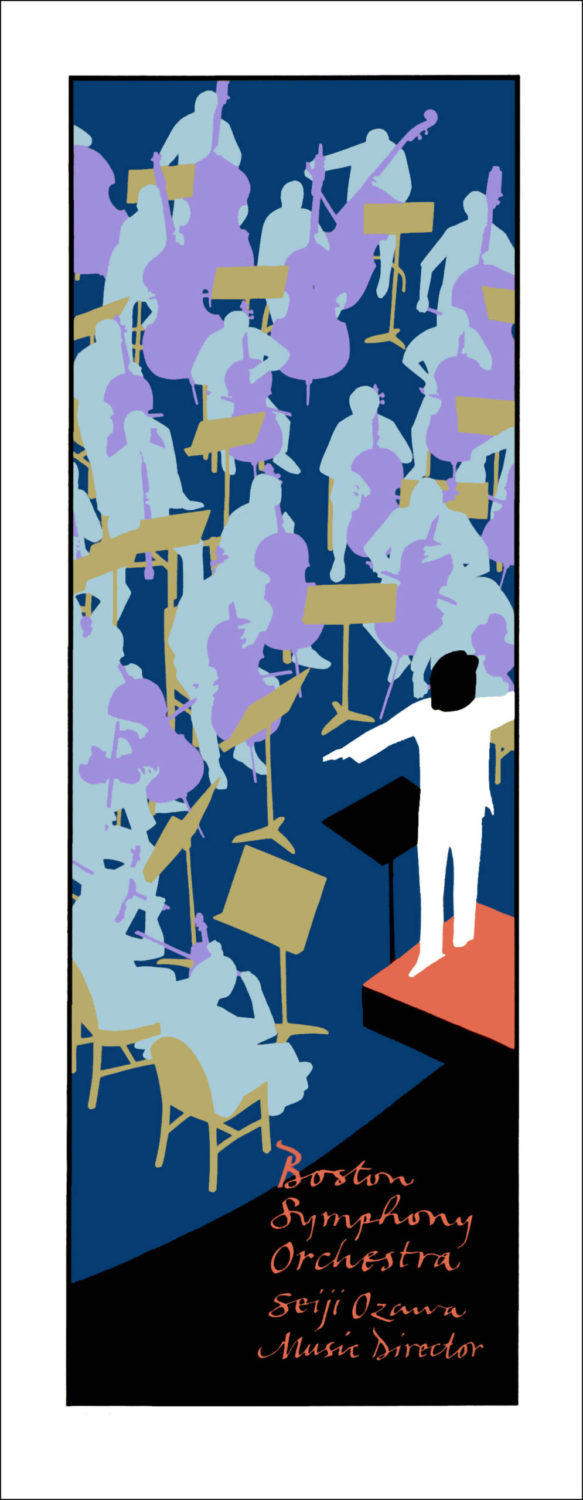
Hidy’s color palettes are based on contrast, dominance, and the interplay of warm and cool colors. Many of these posters have a full value range from light to dark elements. Middle tones often prevail, punctuated by light and dark accents. Sometimes Hidy lets cool or neutral colors reverberate across the surface, accented with flashes of vibrant high intensity chroma. His 1983 Boston Symphony Orchestra poster has a lilting rhythm of icy pale blue musicians, pastel violet instruments, and yellow ochre (though threatening to become a green) music stands. These close-valued forms move against a deep blue background, accented by a muted orange platform holding the black and white conductor. Subtlety and vitality coexist.
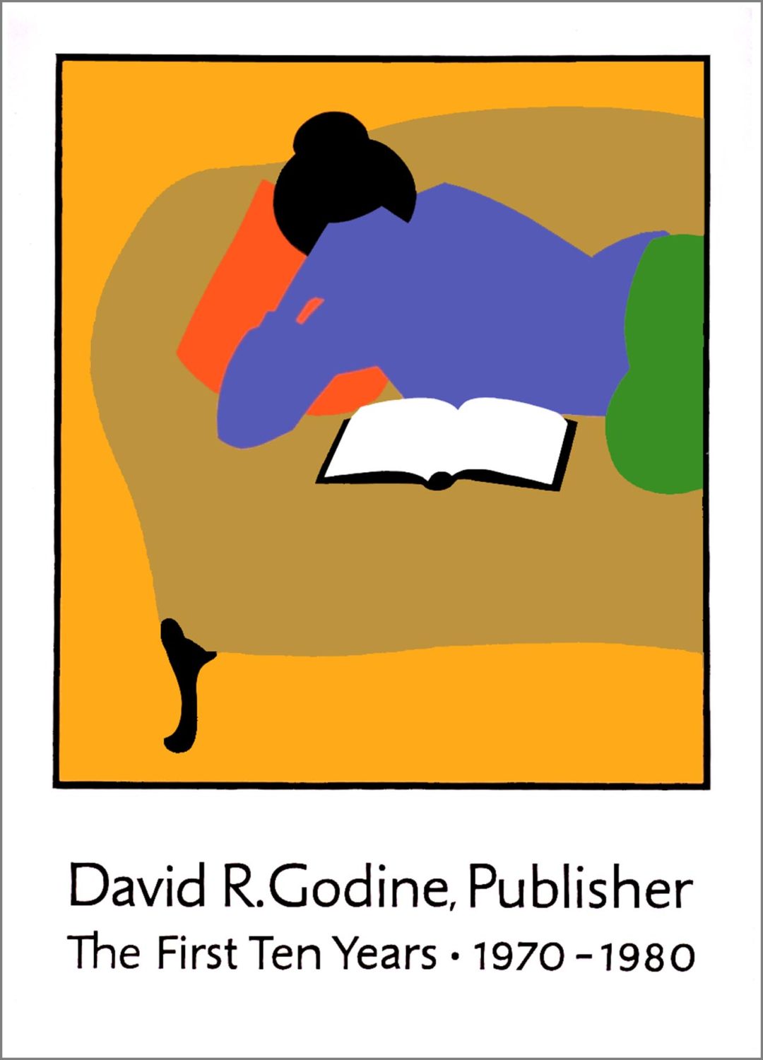
In other posters, a potent yellow background or crisp white field provides an energized environment that interacts with the subject’s organic shapes. Hidy’s image of a young girl feeding her teddy bear has a dynamic interplay between the white field and the complex of shapes making up the subject. A spatial vigor imbues the image with a quiet dynamism. The yellow ground used in two images depicting a father and his son becomes a field of glowing energy, signifying the power of an interpersonal relationship.
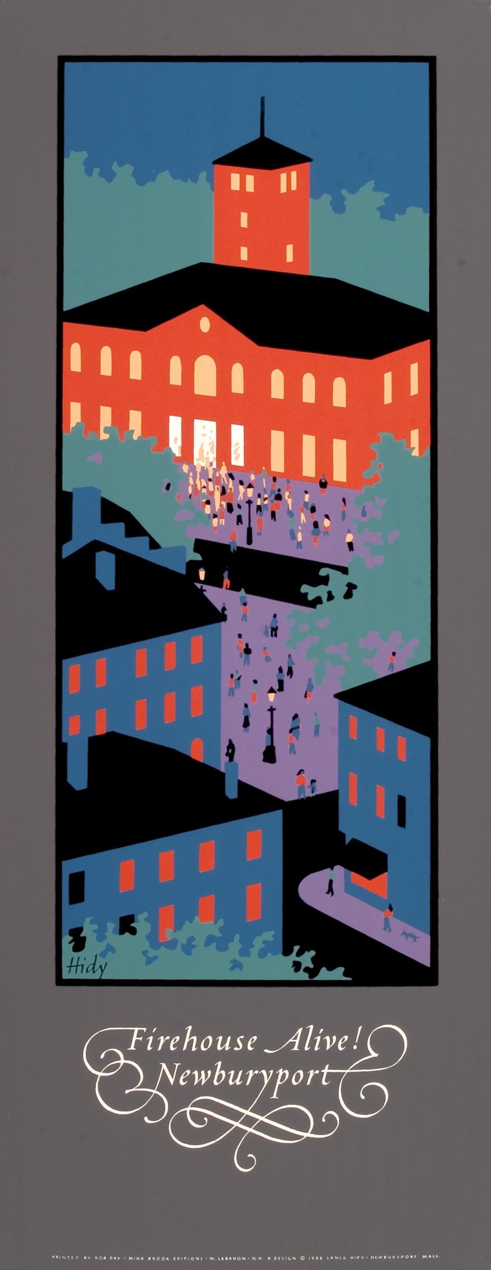
Architectural graphics are often quite stale. Hidy’s posters for two renewal projects, Firehouse Alive! Newburyport and Saint Luke in the Fields, are instructive as case studies in the dynamic presentation of architectural subjects. They also signify Hidy’s ability to invigorate his motifs. Aerial vantage points, tight cropping, simplification, and warm/cool color contrasts are visual operations working in concert to energize the architectural presentation.
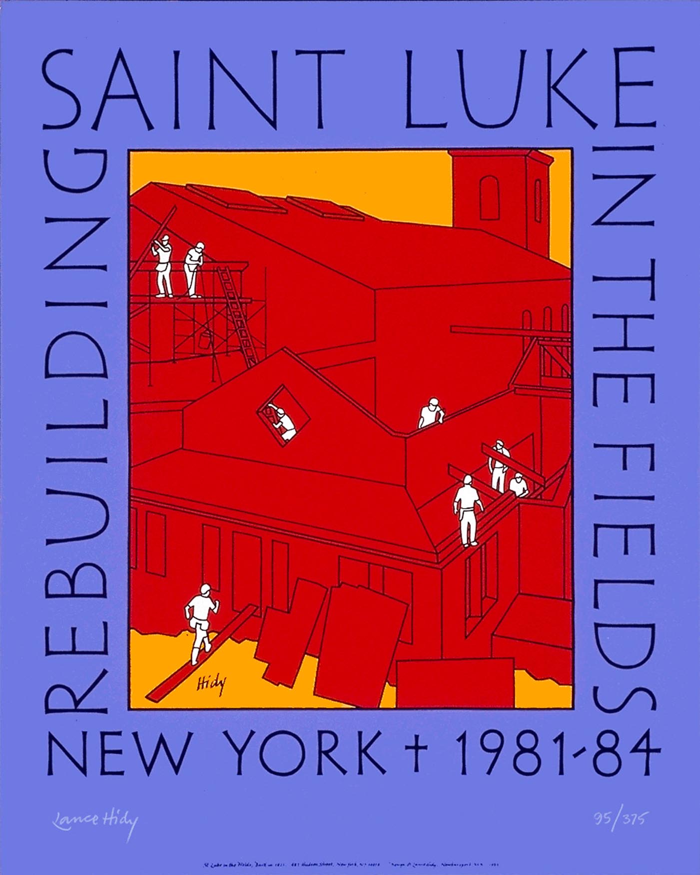
Hidy’s posters frequently have a central focal point. This simple compositional principle creates clarity and instant comprehension. Lettering or type is not integrated into the image, but carefully placed above or below as a discreet but independent adjunct to the dominant image.
The hand-printing process and limited press run of Hidy’s posters position them close to the realm of fine-art prints. Signed and numbered, they become precious artifacts to be collected and displayed, far removed from the glut of mass-market printed ephemera that makes the printing industry one of the ten largest in America.
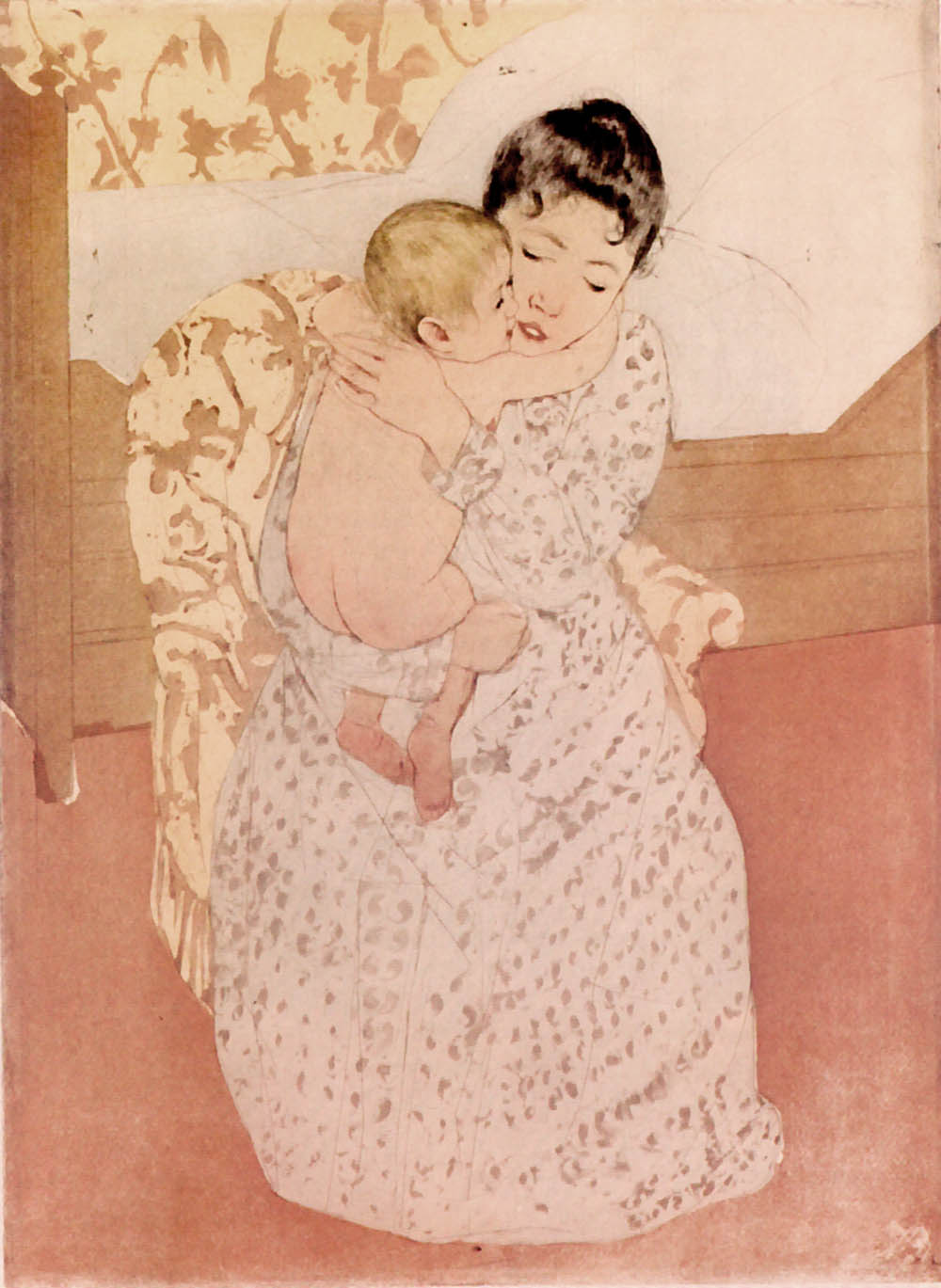
In genre subjects conveying children at play, or the intimacy between parent and child, Hidy has been able to achieve tenderness while avoiding the sentimentality of greeting-card clichés. His works depicting children relate to the traditions of the American Impressionist painter Mary Cassatt and illustrator Jessie Wilcox Smith, but his context and intention are very different. Cassatt and Smith roamed the familiar through portraiture, while Hidy’s approach, editing details and simplifying color, transports his subjects into the sphere of universal symbols.
One indispensable element in much outstanding graphic design is an exemplary client. It is no accident that Hidy’s client list is heavy in social and cultural institutions. Libraries, peace organizations, and book stores have commissioned his posters. Literate and ethical clients become the logical sources for poster commissions that speak to their audience through a dual integrity of form and message.
In 1987, Hidy became a member of Adobe System’s Type Advisory Board, which met twice a year to advise on typeface development. This seven-year appointment marked the beginning of Hidy’s immersion in desktop publishing, Illustrator, and Photoshop.
Hidy’s design of the typeface Penumbra, based upon his poster lettering, was suggested by Sumner Stone. This deceptively radical typeface was created with the assistance of Gino Lee and released in 1994. To the casual eye, Penumbra appears to be yet another alphabet based on antique inscriptions; however, closer inspection reveals that Greco-Roman inscriptional alphabets are successfully blended with twentieth-century geometric letterforms. Penumbra is an Adobe multiple-master typeface. This advanced digital technology permits users to control variations in character attributes such as stroke weight, letter width, and serif size. A designer at her or his computer can produce infinite variations of Penumbra, including sans serif, semi serif, half serif, and heavy serif. At the same time, the stroke weight can be varied from a thin wisp of a line to a bold, heavy form.
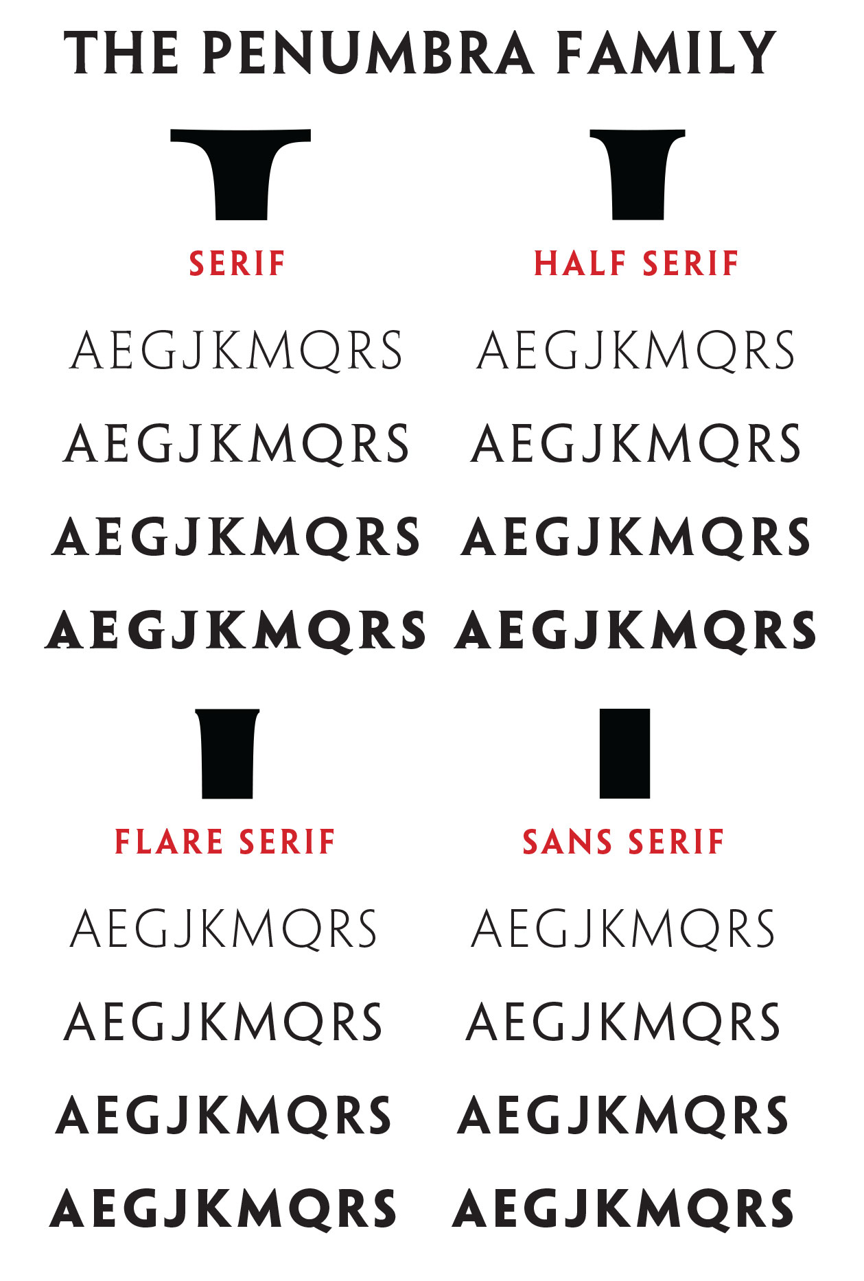
Hidy calls Penumbra “an ‘androgynous’ letterform which morphs seamlessly between the worlds of sans serif and serif. There is no other typeface which does this.” The hand lettering providing Penumbra’s inspiration is a hybrid encompassing characteristics found in both Futura and Trajan. The multiple-master variations permit the whole range of stroke weights and serif variations used in Hidy’s poster lettering. Very few classically proportioned serif typefaces have a monoline stroke, so Penumbra enlarges the typographic vocabulary. By integrating twentieth-century geometric forms with traditional humanistic attributes, Penumbra achieves a softer appearance than geometric sans serif typefaces. Traditional humanist letterforms reflect the use of a broad edged pen, modulating the stroke width. This thick-and-thin stroke contrast is present in humanist sans serifs . Penumbra does the opposite; it combines geometric structure with serifs.
The 1990 poster for the Sioux City Public Library is a transitional work. It is the last poster printed by Rob Day, who posed for this image. It also signals Hidy’s looming immersion into the digital realm. The components of the image-figure, clouds, tree, and bird began their life as photographs that were scanned and transformed into flat planes for silk-screening. The clouds are composed of a low-resolution pattern of computer pixels printed in lavender over a cool pale shade of pink.
The 1990 poster for the Sioux City Public Library is a transitional work. It is the last poster printed by Rob Day, who posed for this image. It also signals Hidy’s looming immersion into the digital realm. The components of the image-figure, clouds, tree, and bird began their life as photographs that were scanned and transformed into flat planes for silk-screening. The clouds are composed of a low-resolution pattern of computer pixels printed in lavender over a cool pale shade of pink.
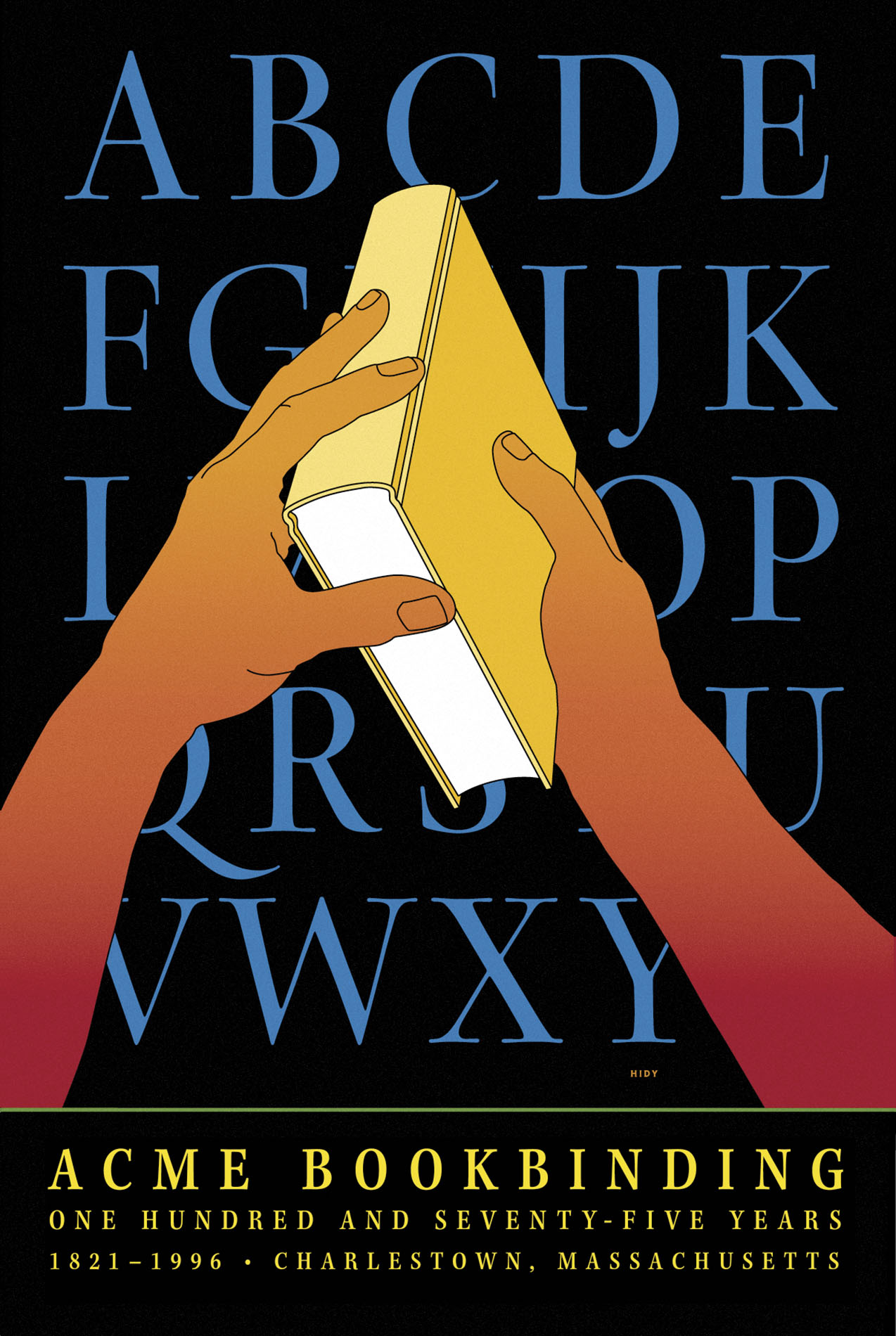
Although later in time, the Acme Bookbinding poster and illustrations for the children’s book, Losing Things at Mr. Mudd’s, appear to be hybrids incorporating Hidy’s earlier methodology with computer graphics. The images are reduced to hard-edged shapes as in the earlier work, but the ink contour drawing found in Hidy’s preliminary studies for the silk-screened posters are retained. These black lines often appeared in preliminary studies for his earlier posters but were dropped in favor of an incisive edge where two shapes butted together. In these later works, color blends are sometimes used in concert with flat planes.
An illustration series for Laura Berk’s 1997 textbook, Child Development, Fourth Edition, more completely revives the approach of Hidy’s pre-Mac images of childhood. The images from this book reproduced here include Climbing a Tree, Chess, and Star. Hidy makes greater use of backgrounds and graded color, and his color palettes are more complex and muted. The shapes are still derived from reference photographs, but his working procedure uses scans and computer tracings instead of pen and ink drawings from projected imagery. Additional images for the 1999 Fifth Edition of Child Development include Puppy, Wheelchair, Kites, and Hand Puppets.
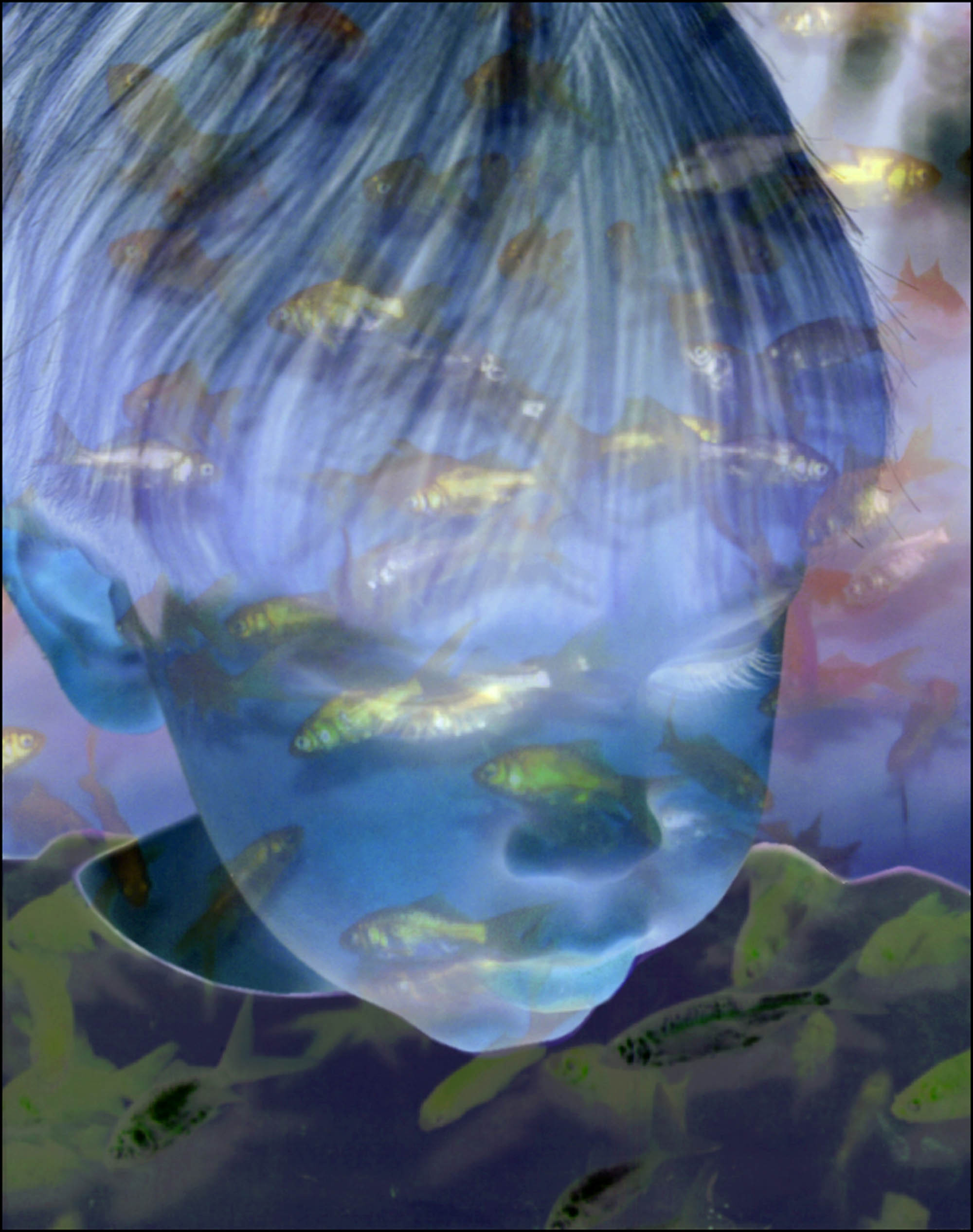
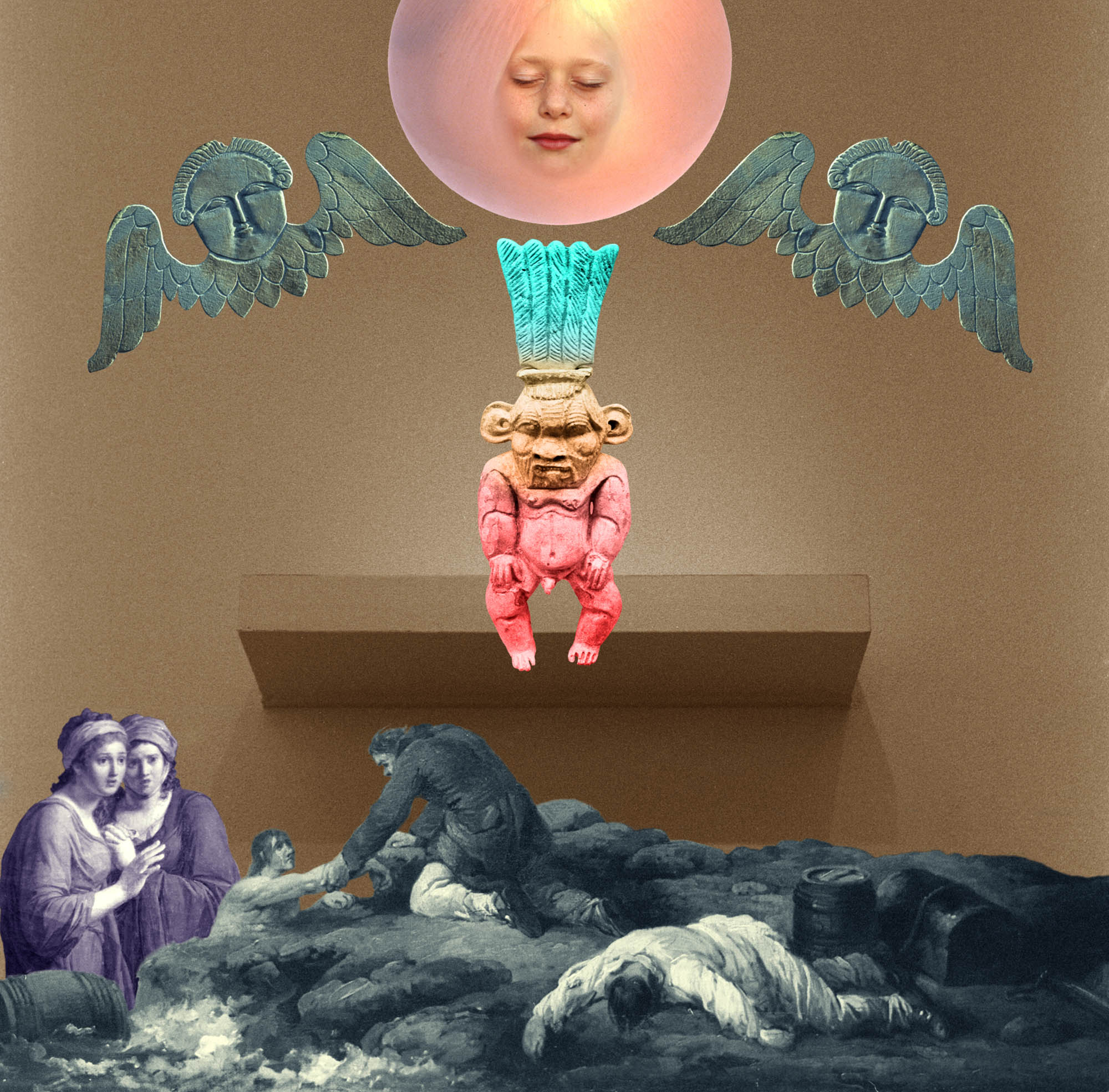
The evolution of Hidy’s imagery took a sharp turn as he explored the visual dynamics of Adobe Photoshop software. His initial photomontages were compilations of images. These montages explored Surrealism’s lyrical disjunctions of scale, time, and space. Flatness of shape was abandoned and replaced by modulated, dimensional imagery. The taut surface of pure colors bounded by razor-sharp edges yielded to a deep and floaty space. Hidy’s computer art combines images of animals, figures, fishes, flowers, and statues; this pictorial range is composed and altered in compositions of melodic visual opulence. But these photomontages are intensely personal and private. Their apparent ambiguity masks covert symbols from Hidy’s personal experiences and dreams. These visual musings about death, sex, and divorce are set in chimerical landscapes, whose bucolic ambiance disguises a psychic tension. Unfettered by the utilitarian needs of specific subject matter or client message, they become pure art.
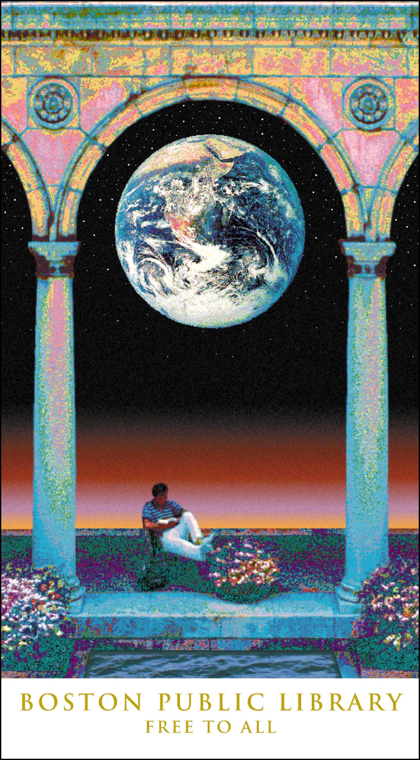
Hidy’s post-Mac posters combine the emblematic directness of his earlier posters with a complexity of color and form that would not have been possible within the limitations of silk-screen printing. The 1991 Boston Public Library poster is Hidy at his most romantic; a reader absorbed in his book sits beneath a classical portico. This architectural edifice is posterized into a pastel cacophony; it frames a NASA photograph of planet earth as seen from space. No longer constrained by the half-dozen colors characterizing his earlier work, Hidy made a quantum jump toward the millions of colors made possible by digital technology.
An early fascination with color blends can be seen in posters printed by Rob Day, who produced graded colors during the actual silk-screen printing process. A blending of colors was used to create a sylvan sunset on a vast horizon in the Boston Public Library poster, but at this stage in the evolution of computer-based output, blends often separated into bands of distinct colors whose edges were blurred together. The effect, though different from Hidy’s original intent, is quite engaging.
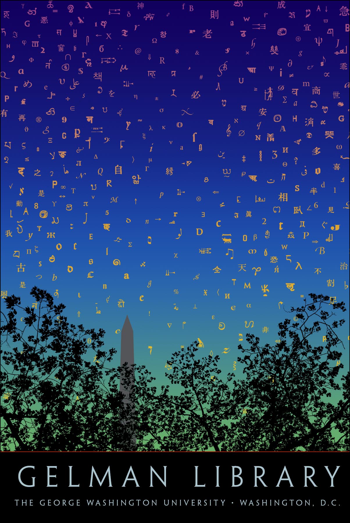
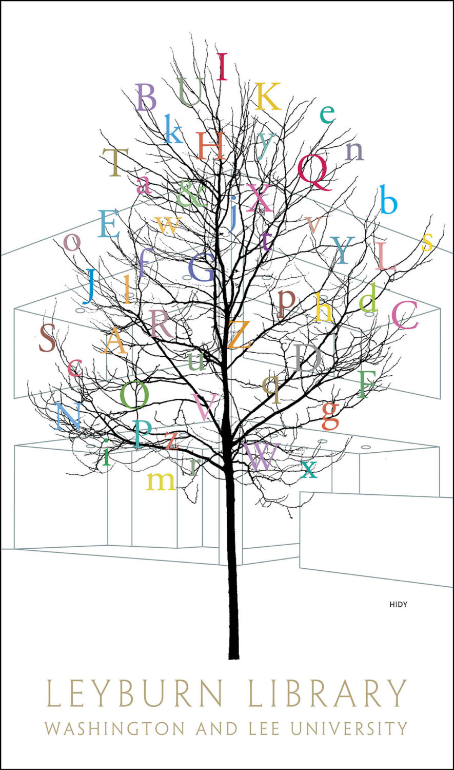
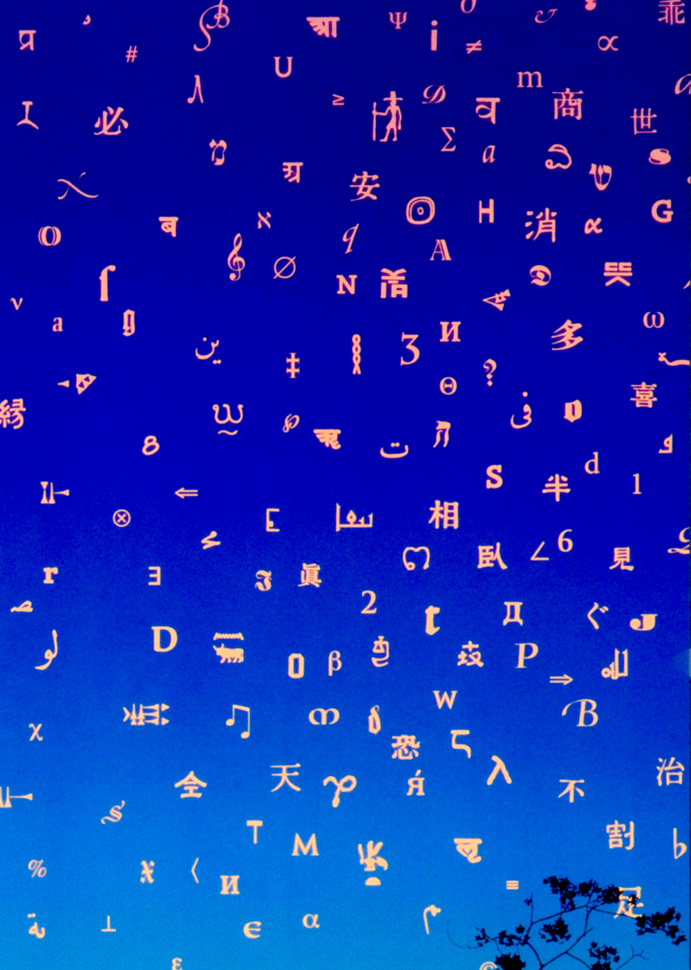
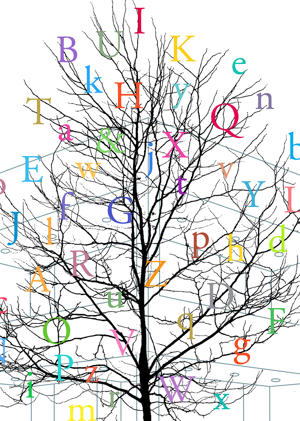
A 1994 poster for the Leyburn Library at Washington and Lee University decorates a sapling outside the lightly delineated building with a prismatic array of letters printed in an extensive range of colors. The following year, The George Washington University’s Gelman Library poster successfully blends a twilight sky. It quickly fades behind a silhouetted row of trees and is twinkled with characters from the type font. Both posters commemorate libraries by paying homage to the alphabet, the system of signs used to house the depository of knowledge found in a library.
The works selected for this intimate little volume represent a quarter-century of Hidy’s oeuvre. They present an engaging view of one designer’s quest to convey messages through a private approach to a public medium. Hidy has moved with the times, while steadfastly avoiding the fate of the hoard of lemmings marching to the beat of the latest design fashion. His work reaffirms the role of designer as a maker of cultural artifacts that help us define our experiences and passage from the past into the future.
Philip B. Meggs (1942-2002) was an author, graphic designer, and educator. He was School of the Arts Research Professor at Virginia Commonwealth University and visiting faculty at The National College of Art & Design, Dublin, & Syracuse University. His book, A History of Graphic Design, received an award for excellence in publishing from The Association of American Publishers.

